Powerball Data Projects (2024)
Data Visualization project
Technique: Techniques: Python, Visual Studio Code, MPI, Data Collection and Organization
Note: This project does not actually have the ability to predict Powerball outcomes, it is more oriented toward visual entertainment
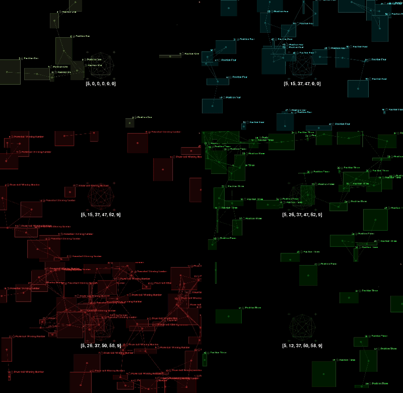
This project collected historical data from 2010 to April 2024 from the New York Lottery website (http://nylottery.ny.gov) and developed data visualizations and simulations for predicting winning numbers based on the collected data. The simulations were deployed across 20 screens using MPI for parallel execution. The objective of this project is to visually represent the top 20 winning Powerball numbers for each Powerball position. After consolidating all the data, I filtered the top 20 most frequent numbers for each position and categorized them into six different effects based on Powerball’s six number positions. Additionally, I incorporated a set of numbers into the overall visual display, mirroring the six positions in Powerball. With each refresh, the most frequent number in that position will be recorded, and it will fresh to this number in that position in the screen. The audience can use the numbers displayed on the screen to assist in predicting Powerball numbers for fun. (This project does not actually have the ability to predict Powerball outcomes, it is more oriented toward visual entertainment)
To enhance the visual appeal of this project, I let the positions of the particles and connecting lines are randomly generated, providing a more intuitive representation of the uncertainty and variability present in real Powerball data. The size of each rectangle changes randomly, symbolizing the randomness of each winning event. Each particle represents a winning point and records the corresponding winning number. Additionally, different color phases highlight the variation in numbers for each position, making the effects more distinct and clearer for each position. This frequent visual appearance and connection help draw attention to which numbers may occur more often. While the positions and connections are random, the visual effect emphasizes certain numbers on the screen. Through these frequent appearances and connections, viewers can notice which numbers stand out more prominently.

During the data collection process, I also applied some simple data visualizations to make the data easier to understand and more visually clear.
Heatmap

Scatter Plot

Top 10 Winning numbers Pie Chart

Coding Process
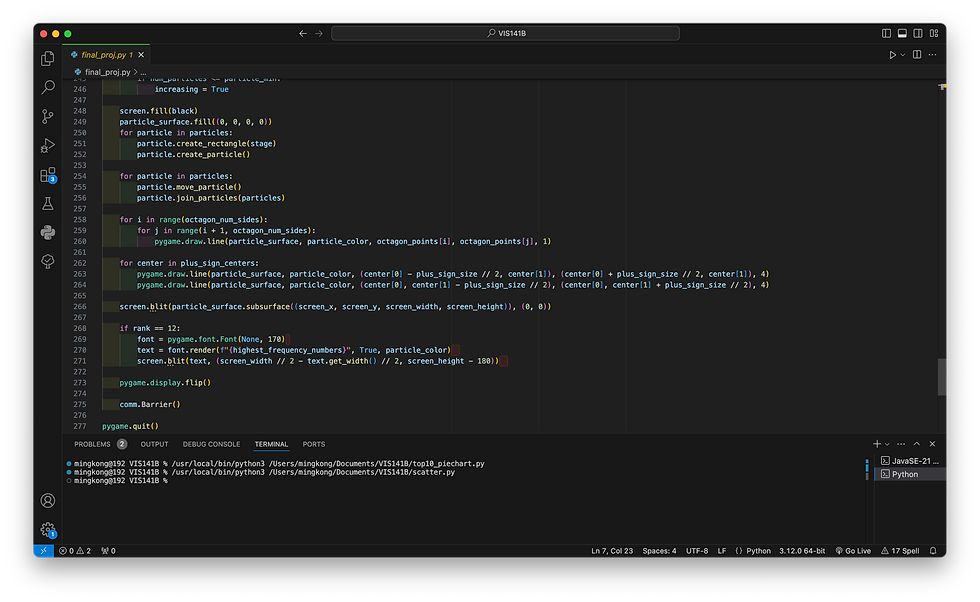
I set up mpi4py to create a communication system between the processes using MPI.COMM_WORLD, which allows the processes to talk to each other. Each process gets a unique ID, known as the rank, and I used this to assign different parts of the screen to each process. Since the total screen is divided into 20 sections (a 4x5 grid), I used the rank to determine which part of the screen each process would be responsible for rendering.
To make sure the random numbers generated by each process are consistent, I had process 0 create a random seed, and then I broadcasted that seed to all other processes using comm.bcast().


